

XY Graph — signal versus signal
The XY Graph plots one signal against another — the horizontal axis is not time but the value of a chosen X signal. It shines wherever the relationship between two quantities says more than their time courses: Lissajous figures, hysteresis loops (B–H, voltage–current, stress–strain), characteristic curves, or phase portraits.
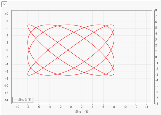
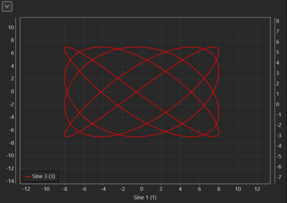
The control accepts numeric scalar variables. Each curve point is formed from a pair of samples: a new sample of a Y signal is paired with the value of the X signal at the same instant — by the samples' timestamps (X is interpolated linearly between two samples), not by the order in which the data arrived — and the point (X, Y) is drawn. The curve is free to double back on itself — with a hysteresis loop, that is exactly the point.
Choosing the X signal
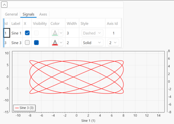
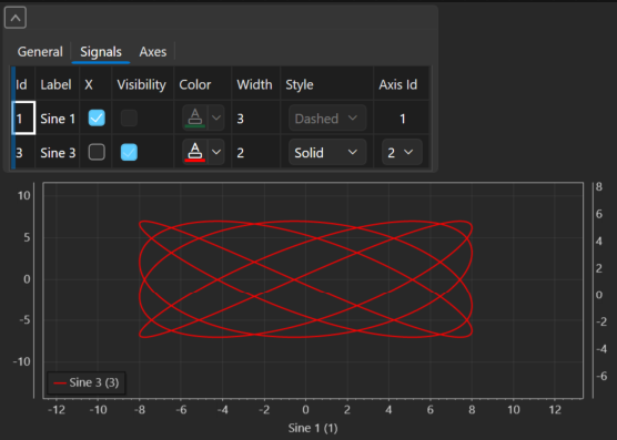
Drag the X signal and all Y signals onto the control just like on a regular graph. The first signal you drop becomes the X signal automatically (the X checkbox in the Signals tab ticks itself); every further signal is a Y signal on the first vertical axis. You can change the choice at any time by ticking the X column on another series — there is always exactly one X signal; its caption appears on the horizontal axis and it is not drawn as a curve. The remaining series are Y signals — several can be shown at once.
When you untick the X checkbox or remove the X signal, the chart clears and waits for you to choose a new X — no other signal is promoted to X on its own (that would silently change the meaning of the figure).
Settings
The control's expandable section has three tabs:
- General — Hor. legend (a horizontal legend), Title (the chart title), and Persistence ms (the age of points): the XY Graph has no time window; instead it keeps a rolling window of the last N milliseconds — older points disappear from the curve. A short persistence shows only the current loop, a long one lets the figure "settle" over several periods.
- Signals — a table of series: X (the X-signal choice), Label, Visibility, Color, Width (line width 1–20), Style (line style — Solid, Dashed, DenselyDashed, Dotted), and Axis Id (assigning a Y series to a vertical axis — axes from number 2 are offered, the X signal is fixed to axis 1). On the X-signal row Visibility, Color, Width and Style are inactive — the X signal is not drawn. Remove a series with right click → Remove.
- Axes — a table of axes: Id, Side, Label, Visibility, Color, and a range — AutoScale or a fixed Min/Max. Row 1 is always the horizontal X axis (it drives the caption, colour and range of the bottom axis; without a caption of its own the X signal's name is used), row 2 the first vertical Y axis — both exist from the start and cannot be removed. Add further vertical axes with right click → Add and remove them with → Remove; an axis used by a signal cannot be removed — the disabled item explains why in its tooltip (e.g. "The axis is used by: …").
Axis scaling
AutoScale (the default on all axes) works like an oscilloscope: the X and Y axes follow the minimum and maximum of the points currently in the persistence window — the range grows and shrinks with the data, with a small margin and rounded values. Switching AutoScale off freezes the last range and lets you enter a fixed Min/Max — also at runtime. Mouse zoom and pan in the chart are kept until you change the axis settings or the automatic scale is recomputed.
Context menu
- Clear Graph — clears the drawn data,
- Zoom to Fit — fits the axes to the current data,
- Export Image — saves a snapshot of the chart (PNG, SVG…),
- Export CSV — saves the series data to CSV,
- Lock — locks the control on the workspace.
Tips
- For the figure to make sense, the X and Y signals should be sampled in the same beat — e.g. a pair of values from one ECU DAQ event channel or from the same periodic event. Samples of one event share their timestamps, so they pair exactly.
- The XY Graph reveals staircase shapes that a time course hides optically: if the X or Y signal is stimulated (bypassed from QInsight, changing only on each write), steps appear in the figure — not a chart error but a faithful picture of the signal. With bypass off the curve is smooth.
- The control's settings (axes, signal assignment, which signal is X) are saved with the workspace.
- It helps to keep the time course of the same signals next door in a regular Graph — the XY Graph does not show time.
Next
The instantaneous value in zones is shown by the Gauge.